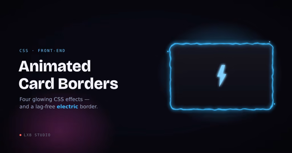
CSS / Front-End
Four glowing border effects, from a one-line pulse to a full electric crackle. Plus the performance tricks that keep them smooth, even the SVG-filter one everybody says lags.
An animated border is the cheapest way to make one card on a page quietly shout “look here.” It’s also where I see the most jank: someone copies a flashy electric-border pen, drops it into a layout, and suddenly the whole page is chugging.
So here are four border effects I actually ship. We’ll start with the one you probably came for, the electric crackle, because it’s the one that needs care, and then three lightweight effects that cost almost nothing. The theme running through all of them: transforms and small repaints are cheap; full-element filters are not. Get that distinction right and you can have all the glow you want at 60fps.
Every example below is a live, working demo.
01The Electric Border
This is the effect everyone wants and half of people can’t get running smoothly. The look comes from an SVG filter: feTurbulence generates a field of animated noise, and feDisplacementMap uses that noise to shove the border’s pixels around, turning a clean 2px stroke into a jittering electric line.
Here’s why it lags, because understanding this is the whole game: a displacement filter re-rasterizes its entire region on every frame, at a cost roughly proportional to its pixel area. The popular pens stack five or six filtered, blurred, and blend-moded layers on top of each other, so the browser runs that expensive per-pixel pass several times over, every frame, forever, whether or not the card is even on screen. Put one halfway down a blog post and it’s burning CPU the entire time someone reads your intro.
Three rules fix it:
One filtered layer, not six. You need exactly one displaced stroke. Do the glow with a plain, static box-shadow (painted once) instead of stacking more filtered layers.
Generate the noise once. Keep baseFrequency and numOctaves fixed, and animate only a feOffset that scrolls the finished noise. Animating the turbulence itself re-computes the entire noise field every frame. That’s the difference between butter and a slideshow.
Pause it off-screen. An SVG’s animations can be stopped with svg.pauseAnimations(), so a few lines of IntersectionObserver mean the crackle only runs while the card is actually visible. The same hook is where you honor prefers-reduced-motion.
Live Demo
Live Wire
One filtered layer, paused when it scrolls out of view.
The HTML
<div class="electric-card">
  <div class="ec-bg"></div>
  <div class="ec-glow"></div>
  <div class="ec-stroke"></div>
  <div class="ec-content">
    <h3>Live Wire</h3>
    <p>Self-contained crackle.</p>
  </div>
</div>

<!-- Define this ONCE per page; point every card at the same id -->
<svg width="0" height="0" aria-hidden="true">
  <filter id="ec-electric" x="-20%" y="-20%" width="140%" height="200%"
          color-interpolation-filters="sRGB">
    <feTurbulence type="fractalNoise" baseFrequency="0.05 0.08"
                  numOctaves="2" seed="5" stitchTiles="stitch" result="noise" />
    <feOffset in="noise" dx="0" dy="0" result="scroll">
      <animate attributeName="dy" values="0; -50; 0" dur="4.5s"
               calcMode="linear" repeatCount="indefinite" />
    </feOffset>
    <feDisplacementMap in="SourceGraphic" in2="scroll" scale="8"
                       xChannelSelector="R" yChannelSelector="G" />
  </filter>
</svg>
The CSS
.electric-card {
  --ec-color: #4cc9f0;
  --ec-glow:  #4361ee;
  position: relative;
  width: 280px;
  border-radius: 16px;
  isolation: isolate;          /* keep the filter on its own layer */
}

.ec-content { position: relative; z-index: 3; padding: 28px; }

/* Solid interior — painted once */
.ec-bg {
  position: absolute; inset: 0; z-index: 0;
  border-radius: inherit;
  background: #0e1018;
}

/* Static halo — NOT filtered, so it costs nothing per frame */
.ec-glow {
  position: absolute; inset: 0; z-index: 1;
  border-radius: inherit;
  box-shadow: 0 0 22px -4px var(--ec-glow),
              inset 0 0 14px -6px var(--ec-color);
}

/* The ONE animated layer: a stroke distorted by the filter */
.ec-stroke {
  position: absolute; inset: 0; z-index: 2;
  border-radius: inherit;
  border: 2px solid var(--ec-color);
  filter: url(#ec-electric) drop-shadow(0 0 4px var(--ec-color));
}
The JavaScript (optional, but this is what keeps a page of them smooth)
const reduce = matchMedia('(prefers-reduced-motion: reduce)').matches;

document.querySelectorAll('.electric-card').forEach((card) => {
  const svg = card.querySelector('svg');
  if (reduce) { svg.pauseAnimations(); return; }   // respect the setting

  new IntersectionObserver((entries) => {
    entries.forEach((e) =>
      e.isIntersecting ? svg.unpauseAnimations() : svg.pauseAnimations()
    );
  }, { rootMargin: '120px' }).observe(card);
});
Two knobs shape it, and getting them in balance is the whole job. scale on the displacement map is the amplitude: how far the line is allowed to jump from the true edge. Around 8 gives a tight crackle that clings to the border; push past roughly 14 and segments start tearing away from the card as a floating ghost outline. baseFrequency on the turbulence is the texture: higher values (0.05–0.1) give a fine, busy crackle, while low values produce big lazy waves. The trap (and it’s an easy one to fall into) is setting the frequency too low: when the noise is that smooth, whole edges drift in the same direction at once instead of jittering in place, and the border detaches. High frequency, modest scale. --ec-color and --ec-glow re-theme the whole thing.
One non-obvious gotcha worth flagging, because it’ll have you second-guessing your code: the filter region (that height="200%" on the <filter>) is deliberately taller than the card. Scrolling the noise with feOffset leaves an empty strip at its trailing edge, and if the region isn’t tall enough to keep that strip below the card, the bottom border periodically loses its crackle and snaps to a clean straight line. Give the noise room to scroll into and the whole edge stays alive.
And to be clear about that demo above: the IntersectionObserver is live on it. Scroll it out of view and the displacement filter genuinely stops, CPU included, then picks back up when it returns.
02The Rotating Glow Border
Want that charged-up feeling without an SVG filter anywhere in sight? Spin a conic gradient around the border with a registered @property, and it’s almost free, since the browser only repaints a thin ring. This is my go-to when the card might appear several times on a page, where the electric border would be overkill.
The structure is the classic gradient-ring trick: a gradient fills the whole box, then a two-layer mask carves out everything but the border. Registering --ec-angle with @property is the part that matters: you can’t animate a raw custom property, but a registered one with a real <angle> type interpolates smoothly.
Live Demo
Charged Up
A conic gradient on a registered property. Cheap, smooth, repeatable.
The Code
@property --ec-angle {
  syntax: "<angle>";
  inherits: false;
  initial-value: 0deg;
}

.glow-card { position: relative; border-radius: 16px; }

/* Rotating gradient ring */
.glow-card::before {
  content: "";
  position: absolute; inset: 0; z-index: 1;
  border-radius: inherit;
  padding: 2px;                          /* = ring thickness */
  background: conic-gradient(from var(--ec-angle), #4cc9f0, #b5179e, #4cc9f0);
  /* show only the 2px ring */
  -webkit-mask: linear-gradient(#000 0 0) content-box, linear-gradient(#000 0 0);
  -webkit-mask-composite: xor;
          mask: linear-gradient(#000 0 0) content-box, linear-gradient(#000 0 0);
          mask-composite: exclude;
  animation: ec-spin 4s linear infinite;
}

.glow-content {
  position: relative; z-index: 0;
  border-radius: inherit;
  padding: 28px;
  background: #0e1018;
  box-shadow: 0 0 24px -6px rgba(76, 201, 240, 0.45);   /* static halo */
}

@keyframes ec-spin { to { --ec-angle: 360deg; } }
Without @property support the angle simply won’t animate. The gradient sits still rather than breaking, so it degrades gracefully on older browsers. Drop the ring to 1px for a finer line, and bump the halo’s blur for more bloom.
03The Breathing Glow
Sometimes you don’t want chaos, you want a heartbeat. A slow pulse on the border color and glow reads as “active” or “live” without grabbing the whole page by the collar. Great for a featured pricing tier or an online-status card. It’s two keyframes.
Live Demo
Standing By
A calm, two-keyframe pulse. Nothing fancy, reads as “alive.”
The Code
.pulse-card {
  border-radius: 16px;
  background: #0e1018;
  border: 1px solid rgba(76, 201, 240, 0.55);
  animation: ec-pulse 2.8s ease-in-out infinite;
}

@keyframes ec-pulse {
  0%, 100% {
    box-shadow: 0 0 12px -2px rgba(76, 201, 240, 0.4);
    border-color: rgba(76, 201, 240, 0.5);
  }
  50% {
    box-shadow: 0 0 26px 2px rgba(76, 201, 240, 0.85);
    border-color: rgba(76, 201, 240, 1);
  }
}
Animating box-shadow does trigger a repaint each frame. On one card that’s a non-issue. If you’re pulsing a whole grid, move the glow onto a pseudo-element and animate its opacity instead. Opacity rides the compositor, so the browser doesn’t repaint anything.
04The Sheen Sweep
Less a border, more a finish: a glare that sweeps across the surface every few seconds, like light catching a holographic trading card. It’s the cheapest effect on this list, because the whole thing rides on transform, the one property (alongside opacity) you can animate without forcing a single repaint.
Live Demo
Holo Finish
A skewed highlight on transform. The GPU doesn’t even blink.
The Code
.sheen-card {
  position: relative;
  overflow: hidden;                       /* clips the glare to the corners */
  border-radius: 16px;
  background: linear-gradient(135deg, #16161f, #0e1018);
  border: 1px solid #2a2a3a;
}

.sheen-card::after {
  content: "";
  position: absolute; top: 0; left: 0;
  width: 60%; height: 100%;
  background: linear-gradient(90deg, transparent, rgba(255,255,255,0.16), transparent);
  transform: translateX(-180%) skewX(-20deg);
  animation: ec-sheen 3.5s ease-in-out infinite;
}

@keyframes ec-sheen {
  0%        { transform: translateX(-180%) skewX(-20deg); }
  55%, 100% { transform: translateX(320%)  skewX(-20deg); }
}
The hold from 55% to 100% is what gives it that “sweep, then pause, then sweep again” rhythm instead of a relentless strobe. And overflow: hidden is doing the quiet work of keeping the glare inside the rounded corners.
Wrapping Up
The pattern across all four is the same lesson: transforms, opacity, and small repaints are cheap; full-element filters and blends are expensive. You can absolutely ship the electric border. It looks incredible, and nothing else quite matches it. You just have to treat it like the expensive guest it is. One filtered layer, noise generated once, and paused the moment it leaves the screen. Do that and even a page full of crackling cards holds 60fps.
Want a card, a hero, or a whole site that uses effects like these and still scores green on Core Web Vitals? That balance, striking work that stays fast, is what we do. Let’s talk.
Like the “lightening” effect. May use something like this on a large scale, say whole site border ?