Vintage newspaper website theme created with pure CSS – no images required
Learn how to build an authentic 1940s detective agency aesthetic using only CSS. No Photoshop, no stock photos – just custom properties, Google Fonts, and clever pseudo-elements.
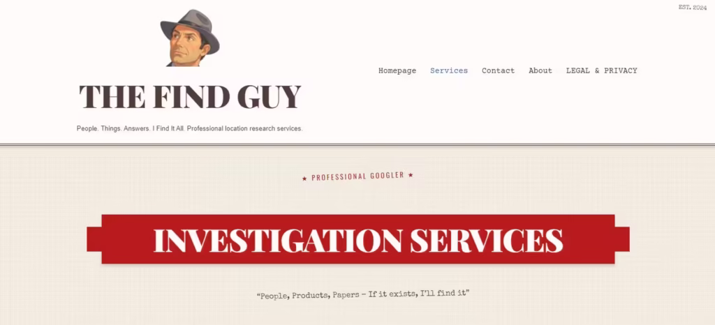
When we built TheFindGuy.com – a “Professional Googler” service with a vintage detective agency vibe – we had a choice: hunt for stock photos of aged paper and ink stamps, or build the entire aesthetic with pure CSS.
We chose CSS. Zero images for the vintage effect. Everything you see is code.
Here’s exactly how we did it.
The Color Palette: CSS Custom Properties
Every vintage design starts with the right colors. We defined these as CSS custom properties so they’re reusable everywhere:
:root {
    --paper-cream: #F4F1E4;
    --paper-white: #FDFCF8;
    --ink-brown: #3E2723;
    --stamp-red: #B71C1C;
    --aged-gold: #D4A574;
    --coffee-stain: #C8A882;
    --shadow: rgba(62, 39, 35, 0.2);
    --faded-ink: #5D4E37;
}
The key insight: vintage paper isn’t white. It’s cream (#F4F1E4). And ink isn’t black – it’s a deep brown (#3E2723) that looks like it came from a fountain pen.
Typography: The Font Stack That Sells It
Fonts do 80% of the work in a vintage theme. We used three Google Fonts, each with a specific purpose:
/* Headlines - Classic newspaper masthead feel */
h1, .site-title {
    font-family: "Playfair Display", serif;
    font-weight: 900;
    text-transform: uppercase;
    letter-spacing: -0.02em;
}

/* Body text - Typewriter aesthetic */
p, li {
    font-family: "Courier Prime", monospace;
    line-height: 1.8;
}

/* Handwritten notes - Personal touch */
.handwritten {
    font-family: "Special Elite", cursive;
    transform: rotate(-1deg);
}
The slight rotation on handwritten elements makes them feel like someone actually wrote them by hand. Small detail, big impact.
Pro tip: Load fonts asynchronously to avoid render-blocking. Use
font-display: swapin your @font-face declarations.
Paper Texture Without Images
Here’s where CSS gets clever. We created the aged paper texture using layered gradients and a pseudo-element:
body {
    background-color: var(--paper-cream);

    /* Subtle grid pattern like old newspaper */
    background-image:
        repeating-linear-gradient(
            0deg,
            transparent,
            transparent 2px,
            rgba(62, 39, 35, 0.02) 2px,
            rgba(62, 39, 35, 0.02) 4px
        ),
        repeating-linear-gradient(
            90deg,
            transparent,
            transparent 2px,
            rgba(62, 39, 35, 0.02) 2px,
            rgba(62, 39, 35, 0.02) 4px
        );
}

/* Age spots and variations */
body::before {
    content: "";
    position: fixed;
    top: 0;
    left: 0;
    width: 100%;
    height: 100%;
    opacity: 0.03;
    pointer-events: none;
    background:
        radial-gradient(
            circle at 20% 80%,
            transparent 50%,
            rgba(200, 168, 130, 0.1) 50%
        ),
        radial-gradient(
            circle at 80% 20%,
            transparent 50%,
            rgba(200, 168, 130, 0.1) 50%
        );
    z-index: 1;
}
The repeating linear gradients create a subtle grid pattern. The radial gradients on the pseudo-element add those random darker spots you see on aged paper. All at very low opacity so it’s felt, not seen.
Ribbon Banners with Border Triangles
Those classic ribbon banners with folded ends? Pure CSS using border triangles on pseudo-elements:
.ribbon-banner {
    position: relative;
    background: var(--stamp-red);
    color: var(--paper-white);
    text-align: center;
    padding: 15px 60px;
    margin: 50px 30px;
    box-shadow: 0 4px 6px var(--shadow);
}

/* Left fold */
.ribbon-banner::before {
    content: "";
    position: absolute;
    top: 50%;
    left: -30px;
    transform: translateY(-50%);
    border-style: solid;
    border-width: 25px 30px 25px 0;
    border-color: transparent var(--stamp-red) transparent transparent;
}

/* Right fold */
.ribbon-banner::after {
    content: "";
    position: absolute;
    top: 50%;
    right: -30px;
    transform: translateY(-50%);
    border-style: solid;
    border-width: 25px 0 25px 30px;
    border-color: transparent transparent transparent var(--stamp-red);
}
The trick is using borders with transparent sides to create triangles. Adjust the border-width values to change the fold angle.
Rubber Stamp Effects
Those “CASE CLOSED” stamps are just styled text:
.stamped {
    font-family: "Oswald", sans-serif;
    text-transform: uppercase;
    letter-spacing: 3px;
    color: var(--stamp-red);
    font-weight: 700;

    /* Optional: add slight rotation for authenticity */
    display: inline-block;
    transform: rotate(-2deg);

    /* Optional: border version */
    border: 3px solid var(--stamp-red);
    padding: 5px 15px;
}
The key is uppercase text with wide letter-spacing. For extra authenticity, add a slight rotation – real stamps are never perfectly straight.
Vintage Buttons with Offset Shadows
Modern shadows are soft and diffused. Vintage shadows are hard and offset:
.vintage-button {
    display: inline-block;
    background: var(--ink-brown);
    color: var(--paper-white);
    padding: 12px 30px;
    border: 2px solid var(--ink-brown);

    /* The vintage touch - hard offset shadow */
    box-shadow: 4px 4px 0px var(--aged-gold);

    /* Typography */
    font-family: "Oswald", sans-serif;
    text-transform: uppercase;
    letter-spacing: 2px;
    text-decoration: none;

    /* Interaction */
    transition: transform 0.1s, box-shadow 0.1s;
}

.vintage-button:hover {
    transform: translate(2px, 2px);
    box-shadow: 2px 2px 0px var(--aged-gold);
}
The hover effect moves the button toward its shadow, creating a satisfying “press” feeling. No blur on the shadow – keep it sharp.
Double Borders for That Old Document Feel
Single borders look modern. Double borders look like legal documents from 1950:
.document-card {
    border: 3px double var(--ink-brown);
    padding: 20px;
    background: var(--paper-white);
}

/* For headers */
.site-header {
    border-bottom: 4px double var(--ink-brown);
    border-top: 1px solid var(--ink-brown);
}
Combine with the paper background colors and you’ve got instant authenticity.
Handwritten Notes with Rotation
Adding handwritten elements breaks up the formality. The secret is subtle rotation:
.handwritten {
    font-family: "Special Elite", cursive;
    color: var(--faded-ink);
    transform: rotate(-1deg);
    margin-left: 20px;
}

/* Variation with more personality */
.handwritten-note {
    font-family: "Special Elite", cursive;
    color: var(--faded-ink);
    transform: rotate(-2deg);
    position: relative;
    padding-left: 30px;
}

.handwritten-note::before {
    content: "*";
    position: absolute;
    left: 10px;
    color: var(--stamp-red);
}
Keep rotations between -3deg and 3deg. More than that looks intentional rather than natural.
Coffee Stain Effect (Bonus)
Want to add coffee ring stains? Radial gradients:
.coffee-stain {
    position: relative;
}

.coffee-stain::after {
    content: "";
    position: absolute;
    top: -20px;
    right: -20px;
    width: 80px;
    height: 80px;
    border-radius: 50%;
    background: radial-gradient(
        circle,
        transparent 30%,
        rgba(200, 168, 130, 0.15) 30%,
        rgba(200, 168, 130, 0.15) 50%,
        transparent 50%
    );
    transform: rotate(15deg);
    pointer-events: none;
}
This creates a ring (not a filled circle) with the coffee stain color at low opacity.
Mobile Considerations
Vintage themes can break on mobile if you’re not careful. Key adjustments:
@media screen and (max-width: 768px) {
    /* Reduce ribbon banner complexity */
    .ribbon-banner {
        margin: 25px 10px;
        padding: 15px 20px;
    }

    .ribbon-banner::before,
    .ribbon-banner::after {
        border-width: 20px 15px 20px 0;
    }

    .ribbon-banner::before {
        left: -15px;
    }

    .ribbon-banner::after {
        right: -15px;
    }

    /* Stack columns */
    .two-column {
        column-count: 1;
    }

    /* Reduce decorative rotations */
    .handwritten {
        transform: none;
    }
}
The ribbon fold triangles need smaller borders on mobile to fit the narrower container.
The Complete Starter Template
Here’s everything combined into a copy-paste starter:
/* ================================
   VINTAGE NEWSPAPER THEME
   Pure CSS - No Images Required
   ================================ */

:root {
    /* Color Palette */
    --paper-cream: #F4F1E4;
    --paper-white: #FDFCF8;
    --ink-brown: #3E2723;
    --stamp-red: #B71C1C;
    --aged-gold: #D4A574;
    --coffee-stain: #C8A882;
    --shadow: rgba(62, 39, 35, 0.2);
    --faded-ink: #5D4E37;
}

/* Base Styles */
body {
    background-color: var(--paper-cream);
    background-image:
        repeating-linear-gradient(
            0deg,
            transparent,
            transparent 2px,
            rgba(62, 39, 35, 0.02) 2px,
            rgba(62, 39, 35, 0.02) 4px
        ),
        repeating-linear-gradient(
            90deg,
            transparent,
            transparent 2px,
            rgba(62, 39, 35, 0.02) 2px,
            rgba(62, 39, 35, 0.02) 4px
        );
    font-family: "Courier Prime", monospace;
    color: var(--ink-brown);
    line-height: 1.8;
}

/* Typography */
h1, h2, h3, .site-title {
    font-family: "Playfair Display", serif;
    font-weight: 900;
    text-transform: uppercase;
    letter-spacing: -0.02em;
}

.handwritten {
    font-family: "Special Elite", cursive;
    color: var(--faded-ink);
    transform: rotate(-1deg);
}

.stamped {
    font-family: "Oswald", sans-serif;
    text-transform: uppercase;
    letter-spacing: 3px;
    color: var(--stamp-red);
    font-weight: 700;
}

/* Components */
.ribbon-banner {
    position: relative;
    background: var(--stamp-red);
    color: var(--paper-white);
    text-align: center;
    padding: 15px 60px;
    margin: 50px 30px;
    box-shadow: 0 4px 6px var(--shadow);
}

.ribbon-banner::before,
.ribbon-banner::after {
    content: "";
    position: absolute;
    top: 50%;
    transform: translateY(-50%);
    border-style: solid;
    border-color: transparent;
}

.ribbon-banner::before {
    left: -30px;
    border-width: 25px 30px 25px 0;
    border-right-color: var(--stamp-red);
}

.ribbon-banner::after {
    right: -30px;
    border-width: 25px 0 25px 30px;
    border-left-color: var(--stamp-red);
}

.vintage-button {
    display: inline-block;
    background: var(--ink-brown);
    color: var(--paper-white);
    padding: 12px 30px;
    border: 2px solid var(--ink-brown);
    box-shadow: 4px 4px 0px var(--aged-gold);
    font-family: "Oswald", sans-serif;
    text-transform: uppercase;
    letter-spacing: 2px;
    text-decoration: none;
    transition: transform 0.1s, box-shadow 0.1s;
}

.vintage-button:hover {
    transform: translate(2px, 2px);
    box-shadow: 2px 2px 0px var(--aged-gold);
}

.document-card {
    border: 3px double var(--ink-brown);
    padding: 20px;
    background: var(--paper-white);
}

/* Mobile */
@media screen and (max-width: 768px) {
    .ribbon-banner {
        margin: 25px 10px;
        padding: 15px 20px;
    }

    .ribbon-banner::before,
    .ribbon-banner::after {
        border-width: 20px 15px;
    }

    .ribbon-banner::before { left: -15px; }
    .ribbon-banner::after { right: -15px; }

    .handwritten { transform: none; }
}
Google Fonts to Include
Add this to your <head>:
<link rel="preconnect" href="https://fonts.googleapis.com">
<link rel="preconnect" href="https://fonts.gstatic.com" crossorigin>
<link href="https://fonts.googleapis.com/css2?family=Courier+Prime&family=Oswald:wght@600;700&family=Playfair+Display:wght@900&family=Special+Elite&display=swap" rel="stylesheet">
See It Live
Check out the full implementation at TheFindGuy.com – a vintage detective agency theme built entirely with these techniques.
No stock photos. No Photoshop. Just CSS.
Frequently Asked Questions
Can you create vintage effects without images?
Yes! Using CSS gradients, custom properties, and pseudo-elements you can create paper textures, coffee stains, and aged effects entirely with code.
What fonts work best for vintage web design?
Playfair Display for headlines, Courier Prime for body text, and Special Elite for handwritten notes. All free from Google Fonts.
How do you create paper texture with CSS?
Use repeating linear gradients for subtle grid patterns, and radial gradients on pseudo-elements for age spots and variations.
How do you make ribbon banners without images?
Use CSS border triangles on ::before and ::after pseudo-elements. The border-width values control the fold angle.
What makes shadows look vintage vs modern?
Modern shadows are soft and diffused. Vintage shadows are hard and offset with no blur – like box-shadow: 4px 4px 0px color.
Does this vintage CSS theme work on mobile?
Yes, with adjustments. Reduce ribbon banner complexity, use smaller border triangles, and remove decorative rotations on screens under 768px.
Need a custom vintage theme for your project? Get in touch – we build websites that stand out.